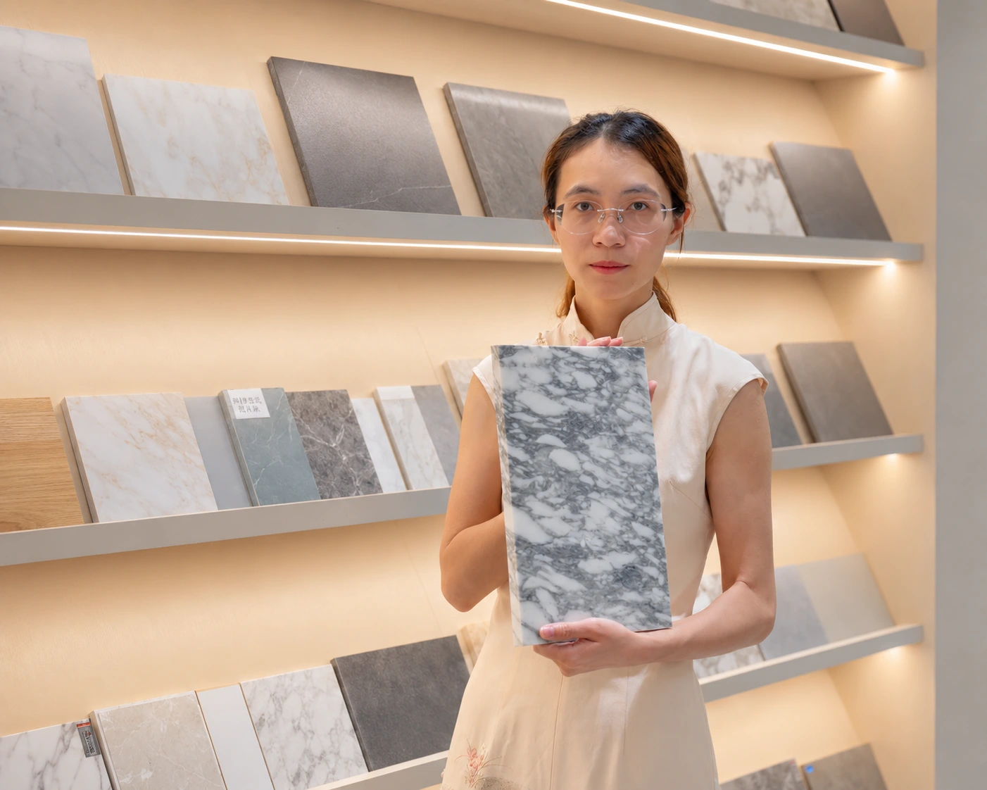
I get calls every month about best kitchen cabinet colors that turned dated fast. Most homeowners want modern kitchen cabinet colors, not just this season’s trend.
The kitchen cabinet colors least likely to look dated are warm neutrals and natural wood tones: warm white, soft off-white, greige, beige, natural oak, and walnut. Muted sage green and careful navy also stay timeless when matched well with the right countertop, floor, and lighting.
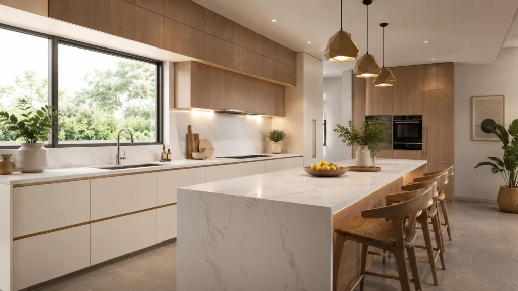
This is not a guess from a design blog. It comes from years on the factory floor, sourcing panels, and walking real clients through renovations that had to last past any single trend cycle. Keep reading, because the real answer sits in how each color works with the whole room, not the color alone.
What Kitchen Cabinet Colors Are Least Likely to Look Dated?
Homeowners often pick a color because it feels popular right now. A few years pass, and the whole kitchen suddenly looks stuck in one year.
The safest kitchen cabinet colors are warm white, soft off-white, greige, beige, natural oak, and walnut. These count among the best neutral kitchen cabinet colors, because they pair with almost any countertop or floor, unlike the most popular kitchen cabinet color 2026 picks that may fade in a few years.
Source:
https://www.nyiad.edu/design-articles/interior-design/5-fun-neutrals-that-aren-t-beige
I sort cabinet colors into three risk levels, not a flat list. Low-risk colors work for a whole house. Medium-risk colors work best in small doses. High-risk colors almost always fade with the trend that made them popular.
Low-Risk Cabinet Colors
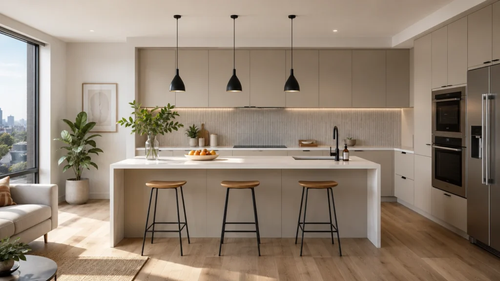
Warm white, soft off-white, greige, beige, natural oak, and walnut sit in the low-risk group. I use these on full kitchens, in villas and apartments alike, because they match almost any countertop, wood floor, or metal hardware without a fight.
Medium-Risk Cabinet Colors
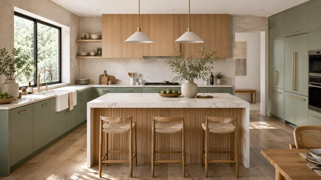
Sage green, olive green, navy, charcoal blue, and two-tone layouts sit in the middle. They look great on an island or lower cabinets. Used across a whole kitchen, in the wrong light, they can start to read as a trend rather than a design choice.
High-Risk Cabinet Colors
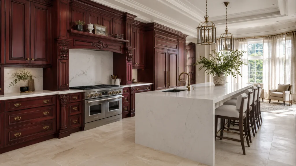
Bright emerald, cool gray, stark white, honey-toned oak, red cherry, high-gloss black, and strong yellow or purple sit in the high-risk group. Each one ties the kitchen to a narrow window of time, and that window closes faster than most owners expect.
| Risk Level | Example Colors | Best Use |
|---|---|---|
| Low | Warm white, off-white, greige, beige, oak, walnut | Full kitchen, any budget |
| Medium | Sage, olive, navy, charcoal blue, two-tone | Island, lower cabinets |
| High | Emerald, cool gray, stark white, honey oak, cherry, gloss black | Small accents only, if at all |
I never tell a client a color will “never” go dated. Nothing is permanent in a kitchen. What I do tell them is that low-risk colors survive changes in countertop trends, hardware trends, and even flooring trends, because they sit in the background instead of leading the room. A kitchen ages well when the color supports the material, not when the material has to defend the color.
Why Do Some Kitchen Cabinet Colors Look Dated Faster?
I’ve watched clients spend thousands on a trendy color, then regret it inside three years. The color is rarely the real problem on its own.
Cabinet colors look dated fast when the undertone, finish, door style, countertop, floor, hardware, and lighting all point to one era together. Cool grays, bright emerald, mustard, honey oak, and high-gloss finishes tend to age quickest, especially in kitchens with only a short design life.
Five things push a color toward looking dated. None of them are about the color chip alone. All of them are about how that color sits inside the full room.
Too Cool an Undertone
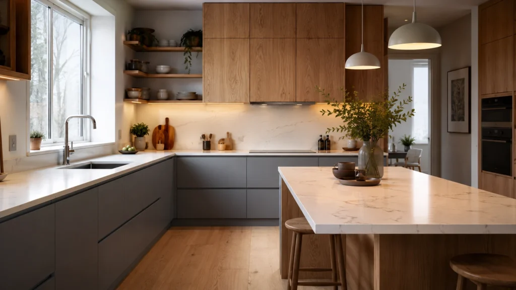
Cool gray and blue-gray cabinets can make a kitchen feel flat and cold, especially under weak daylight. Warm neutrals hide this problem, because a warm undertone still reads as inviting even under mixed lighting.
Extreme Color Choices
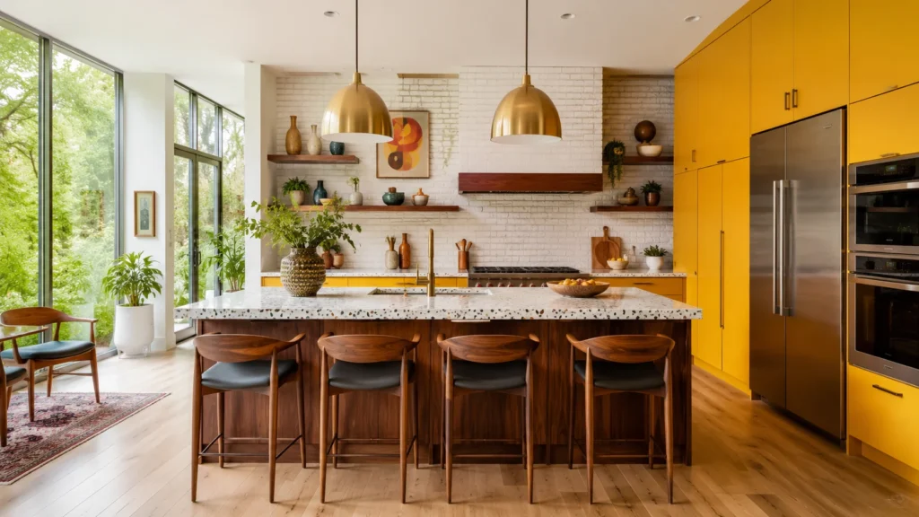
Bright emerald, mustard, red, and orange-cherry cabinets grab attention fast, then tire the eye just as fast. A bold color works in small doses, but rarely survives ten years across a whole kitchen.
Wood Tones With a Timestamp
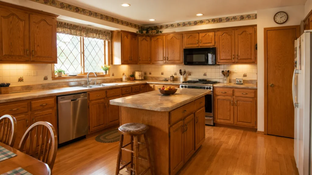
Honey oak, red cherry, espresso, and gray-washed wood all carry a clear timestamp. I still see these tones in older homes, and clients almost always ask how to update them first.
Finishes That Try Too Hard
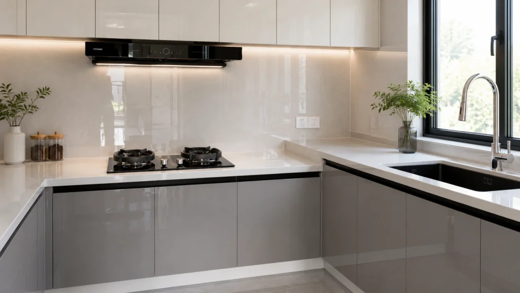
High-gloss, plastic-looking panels read as cheap the moment the light hits them wrong. A soft matte or gentle satin finish ages far better than a mirror-like surface.
Materials That Clash
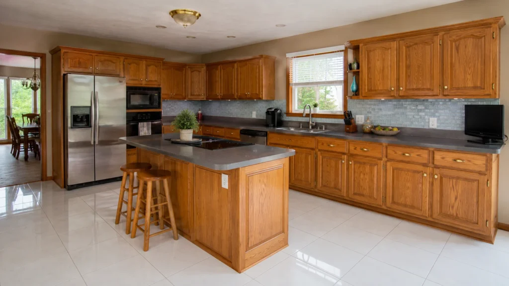
A kitchen looks dated fastest when the cabinet, floor, countertop, and hardware each belong to a different era. One mismatched material can pull the whole room backward in time.
On forums, I read the same regret again and again. One owner painted warm oak cabinets a deep gray, then missed the warmth once it was gone. Another owner chose an all-white kitchen with cool lighting, and it ended up looking like a clinic instead of a home. The lesson is simple. A dated kitchen is rarely one bad color. It is several materials that were only ever meant to match each other for a short season.
How Do You Match Cabinet Colors With Countertops, Floors, Walls, and Appliances?
Clients often ask me for “the right color” before they even mention their countertop or floor. That question has no answer on its own.
Start with the materials you cannot change: floor, countertop, walls, windows, and lighting. Then choose a cabinet color that supports those fixed materials instead of fighting them. This order, fixed materials first, cabinet color second, prevents most matching mistakes I see in real renovations.
Matching works best scenario by scenario, not color by color. Here is how I guide clients once I know their fixed materials.
With White Countertops
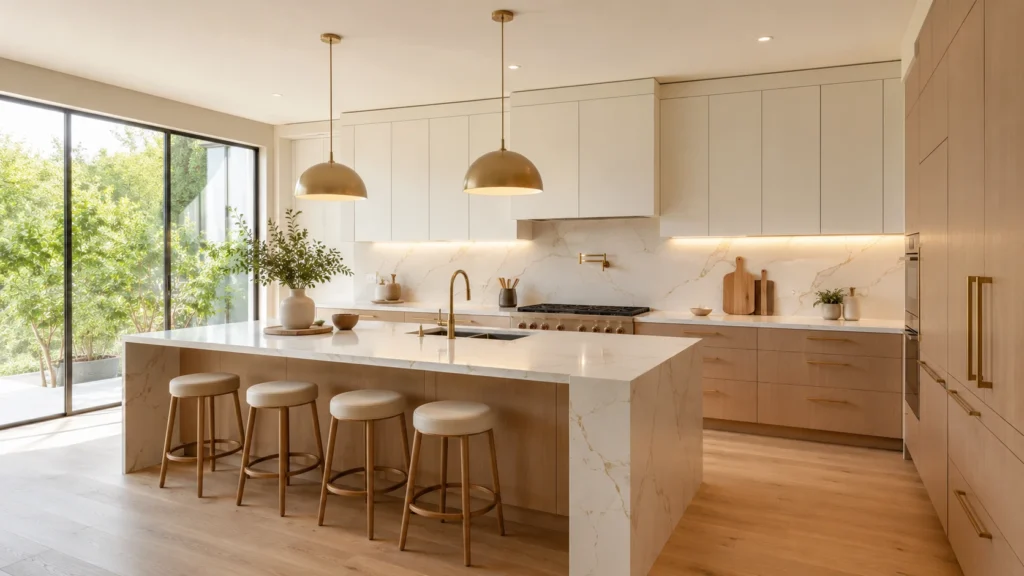
Warm white, greige, light oak, sage, and walnut all work well here. Avoid pairing a cool white cabinet with a cool white countertop, since the two can wash each other out under bright light.
With Black or Dark Countertops
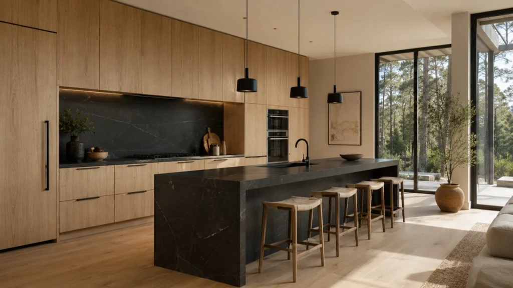
Light oak, warm white, mushroom, taupe, and walnut balance a dark countertop well. I stay careful with an all-black or all-charcoal cabinet here, since two dark surfaces together can shrink a room fast.
With Butcher Block Countertops
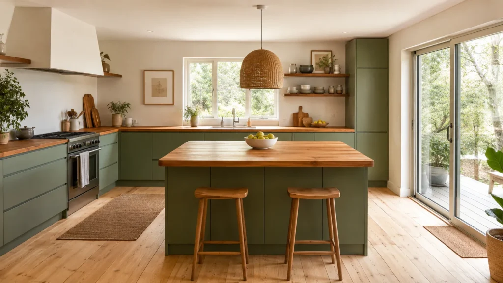
Off-white, sage green, warm beige, and a navy lower cabinet all sit nicely against warm wood counters. This combination reads as calm and lived-in rather than showroom-cold.
With Honey Oak or Dark Floors
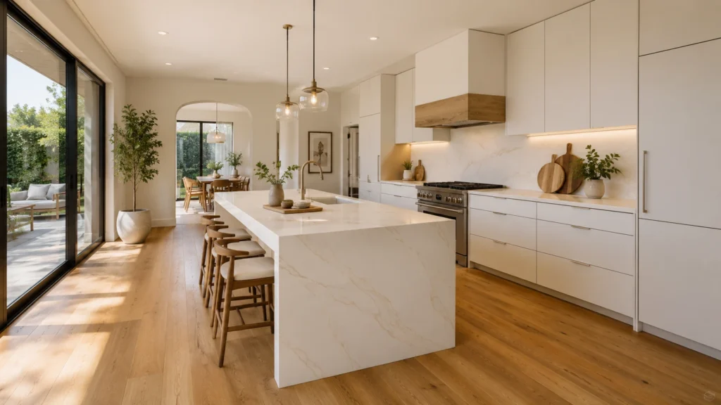
Honey oak floors need a cabinet color that calms the orange undertone, so I lean toward warm white, soft greige, or muted sage. Dark floors need light cabinets, like white oak or warm white, so the room does not feel closed in.
With Stainless Steel Appliances
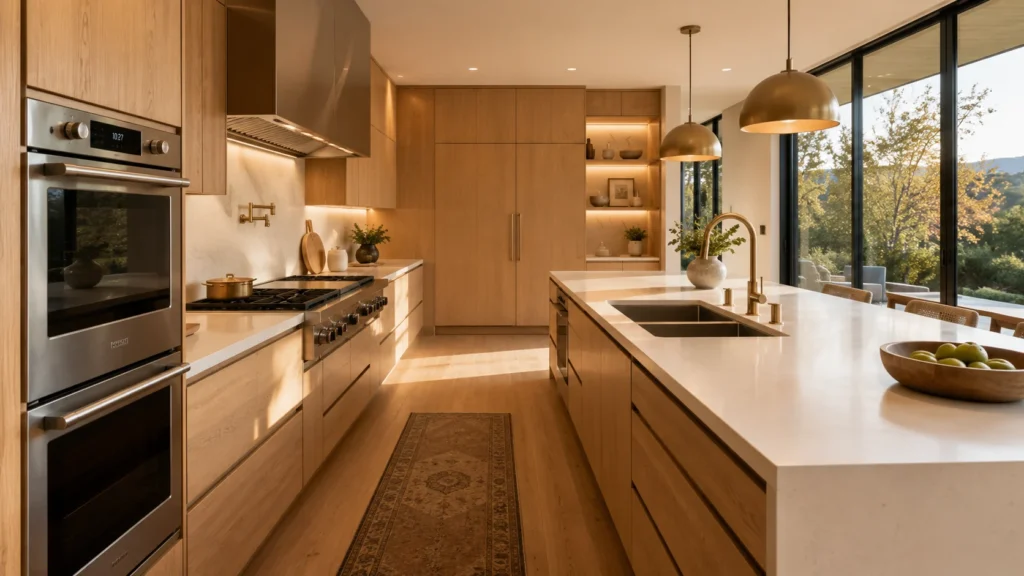
Warm white, greige, wood tones, and charcoal blue all pair well with stainless steel. Warm hardware and warm lighting keep the pairing from feeling too cold or too clinical.
| Fixed Material | Safer Cabinet Colors | Colors to Approach With Care |
|---|---|---|
| White countertop | Warm white, greige, oak, sage, walnut | Cool white on cool white |
| Black countertop | Light oak, warm white, mushroom, taupe | All-black, all-charcoal |
| Dark floor | White oak, warm white | Full dark palette |
| Honey oak floor | Warm white, soft greige, muted sage | Orange-toned wood cabinets |
Clients often ask if cabinets should sit lighter or darker than the walls. My usual answer is that cabinets can sit a shade darker than the wall, so the room gains some depth. In a small kitchen, or one with little daylight, I keep the upper cabinets close to the wall color instead. I also ask clients to test any sample under their own north-facing or south-facing light, not under a showroom bulb, before they trust a photo from a pin board.
Are White, Off-White, Beige, Green, Blue, and Two-Tone Cabinets Still Safe Choices?
Clients bring me a photo from Pinterest and ask if that exact color is still safe. The honest answer depends on the undertone, not the color name.
Yes, most of these colors are still safe, but only in the right version. Warm off-white beats stark white. Warm beige beats cool gray. Muted green beats bright green. Navy in small doses beats navy everywhere. Two-tone works when one color stays quiet.
Are White and Off-White Cabinets Still Timeless?
Yes, but a warm off-white is safer than a stark pure white. Among the best off white kitchen cabinet colors, a soft, creamy shade stays bright without feeling sterile, and it hides daily wear better than a flat, cold white does.
Are Beige and Greige Cabinets a Better Neutral Than Gray?
Yes, warm beige and greige tend to age better than cool gray in most 2026-style kitchens. Among the best beige kitchen cabinet colors, mushroom, putty, taupe, and stone all read as warm and current rather than tied to one narrow trend window.
Are Green Kitchen Cabinets Timeless or Trendy?
Muted sage, olive, and gray-green sit closer to timeless than bright emerald does. Among the best green kitchen cabinet colors, I tell clients to pick a shade slightly less green than they first imagine, since a quieter green wears better over ten years.
Are Blue Cabinets Safe for a Long-Term Kitchen?
Navy and charcoal blue work well on an island or lower cabinet, though a whole kitchen in dark blue needs strong lighting to avoid feeling small. Among the best blue kitchen cabinet colors, I keep the boldest shade to one section, not every wall.
Are Two-Tone Kitchen Cabinets Still a Good Idea?
Yes, as long as the contrast feels planned and one color stays quiet. Popular pairs, among the best two tone kitchen cabinet colors, include a warm white perimeter with a walnut island, or a light oak upper with a muted green lower.
None of these six colors is inherently trendy or timeless on its own. What changes the outcome is the exact undertone, how much of the kitchen wears that color, and how the lighting treats it through the day. A color that feels safe in a showroom can still feel wrong in a north-facing kitchen with little natural light, so I always ask to see the actual room before I confirm any final shade.
Which Cabinet Colors Make a Kitchen Look More Expensive?
Clients often assume the most expensive-looking kitchen needs the boldest color. In my experience, the opposite is usually true.
Colors that make a kitchen look more expensive are usually warm white, mushroom, taupe, walnut, white oak, muted olive, and charcoal blue. These are low in saturation and rich in texture, and they let the material quality show instead of hiding behind a bold shade.
A high-end look comes from how colors combine, not from one color alone. I judge three things before any client places an order.
Color Harmony Across the Room
The cabinet color should agree with the countertop veining, the floor undertone, and the hardware finish. When all four line up, even a simple neutral can look far more expensive than a bold, mismatched color.
Low Saturation Over High Saturation
A low-saturation color almost always reads as calmer and more expensive than a bright, saturated one. Natural wood grain and a soft matte finish support this look far better than a shiny, plastic-like surface.
Finish and Edge Detail
A cheap-looking kitchen often has mismatched panel color, cabinet body color, and edge banding. Before I approve any production, I check the finish sample, the door sample, and the edge banding together under real light.
A cheap kitchen usually shows itself through cold white paired with cold gray under harsh lighting, a bright color spread across every wall, or a glossy film finish that reflects light instead of absorbing it. Before I confirm a color for any client, I always ask to see a 3D design and a physical sample together, since a screen color and a real material sample rarely match under home lighting.
💡 Flawless Custom Cabinets
Explore Solutions →What Are the Best Kitchen Cabinet Color Combinations for 2026?
Clients ask me for “the best kitchen cabinet colors” as if one single shade could carry an entire kitchen alone. A combination almost always works better.
The safest combinations for 2026 are warm white with walnut, off-white with white oak, sage with warm white, greige with a charcoal island, and light oak with creamy stone. Each pairing balances a warm neutral against one deeper accent, instead of one flat, single-color kitchen.
Source:
https://kitchencabinetkings.com/blog/warm-kitchen-trends-2026/
I match each combination to the kind of project it suits best, since a villa, an apartment, and a short-term rental rarely share the same needs.
Warm White Cabinets With a Walnut Island
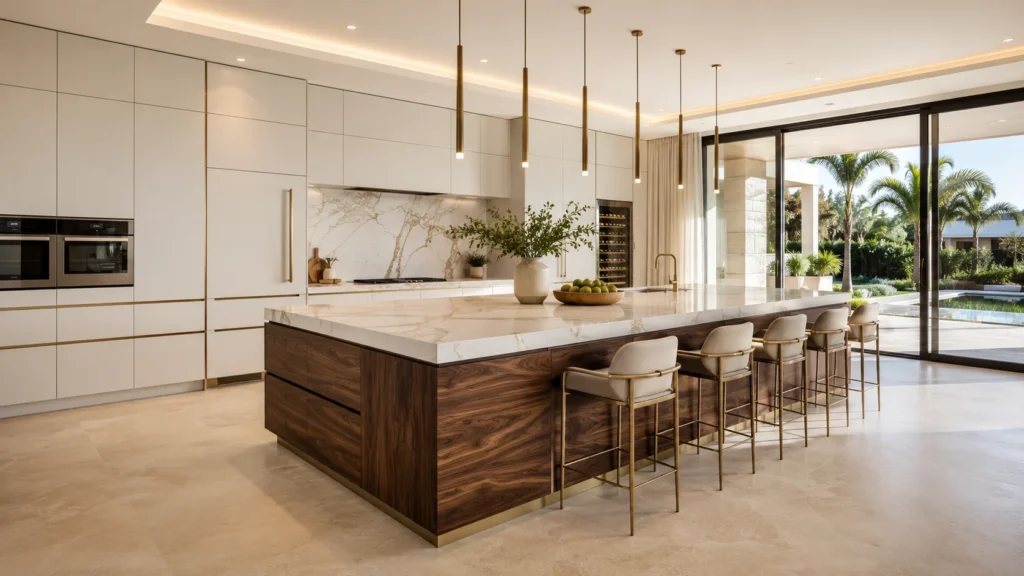
This pairing suits a forever home or a villa well. Brass or warm brushed hardware pulls the two tones together, though the island needs enough overhead light so it does not read as too heavy.
Light Oak With Creamy Stone
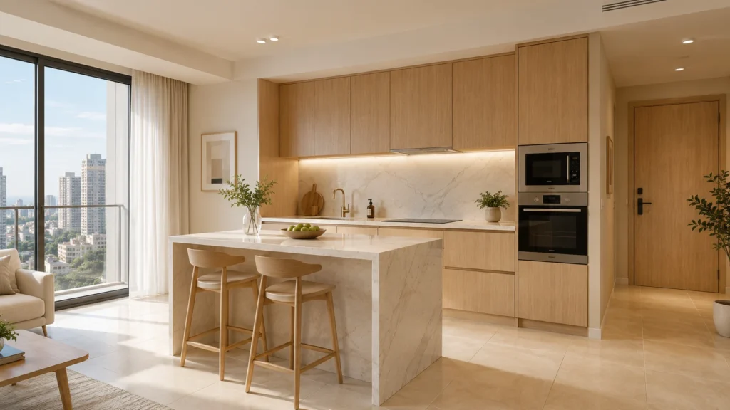
This combination suits a small apartment, since the light tones keep the space feeling open. I keep the wall color soft and warm, so the oak does not feel cold against a stark white wall.
Sage Lower Cabinets With Off-White Uppers
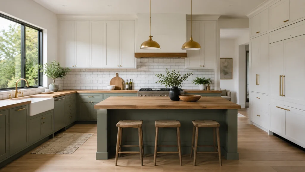
This pairing suits a designer-led renovation with a clear personality. I keep the green closer to gray-green than bright green, and I pair it with a warm stone or butcher block counter.
Greige Perimeter With a Charcoal Island
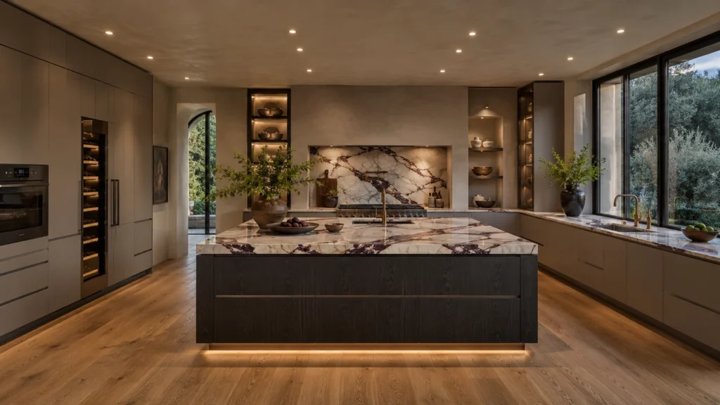
This combination suits a boutique rental or a modern villa kitchen. The perimeter stays quiet and easy to live with, while the island carries the personality, so future buyers are not locked into one bold color.
Every kitchen cabinets color combination pictures search brings up hundreds of inspiration photos, but a photo cannot tell you how a color behaves in your own light or against your own materials. I always tell clients to treat these photos as a starting point, then confirm the final combination with a real sample, a real 3D design, and a real conversation about the materials already fixed in their home.
Luxury Villa Whole-House Customization
Pain Point: A developer faced inconsistent finish tones and cheap-looking edge banding that ruined the high-end feel of their villa project under natural light.
Solution: We provided 1:1 physical sample matching, utilizing low-saturation custom walnut finishes and seamless edge-banding technology for the entire house.
Result: 100% material harmony achieved. Zero site reworks, saving the client 3 weeks in installation time while securing a premium aesthetic.
Conclusion
Timeless cabinet colors come from matching color, material, and lighting, not chasing one trend. Reach out to George Construction Group, and let’s plan your project together.
Timeless cabinet colors come from matching color, material, and lighting, not chasing one trend. But coordinating multiple suppliers to achieve that perfect match is a headache that often leads to budget overruns and clashing styles.
Skip the hassle. At George Construction Group, we are your one-stop solution for custom cabinets, luxury furniture, doors, windows, and sanitary ware. Whether you are outfitting a single apartment or an entire villa project, our integrated supply and spatial design services ensure a flawless finish.
Tell us about your project below, and let’s craft a space that will never go out of style. 👇