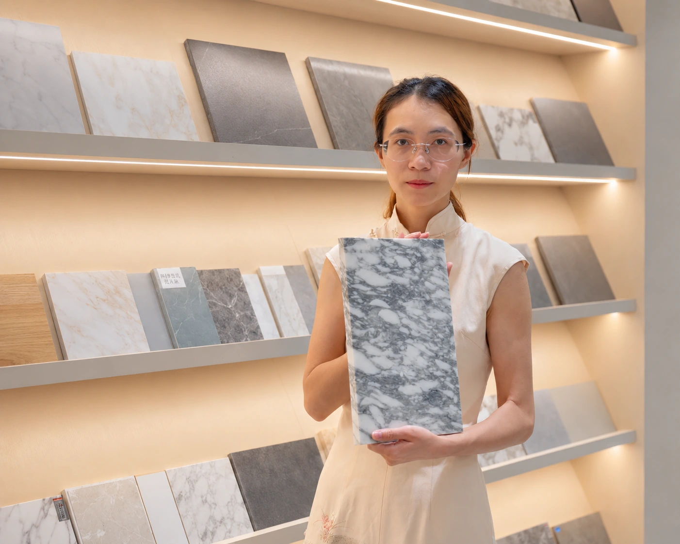
Many homeowners pick taupe kitchen cabinets from a screen and end up with a color that looks gray, muddy, or too yellow in their actual kitchen. The problem is not taupe itself. The problem is choosing without testing.
Taupe kitchen cabinets work best when the shade is matched against your real lighting, wall color, flooring, and countertop. Light taupe suits smaller or darker kitchens. Warm taupe fits high-end homes with wood floors. Dark taupe works in large, well-lit spaces. Always test a real cabinet door sample before production.
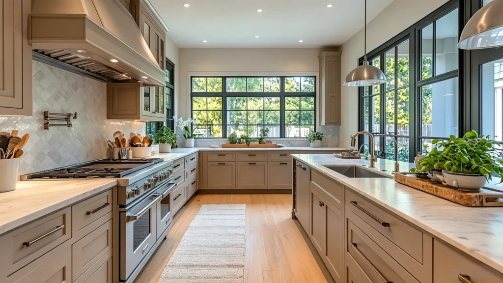
I have worked in cabinet production and whole-house material supply for years. One thing I see again and again is that color decisions made from photos almost never survive contact with a real space. This guide covers everything you need to know before you commit to a taupe cabinet color.
Are Taupe Kitchen Cabinets Still in Style in 2026?
Many people ask if taupe is outdated or if it still works in a modern kitchen. It is a fair question, and the answer depends on how you use it.
Taupe kitchen cabinets are still in style in 2026. The trend has shifted away from cold gray and pure white toward warm neutrals like taupe, greige, and mushroom. These shades offer warmth without the heaviness of dark wood or the sterility of all-white kitchens.
Source:
https://www.instagram.com/reel/DU3tEImDTOc/?hl=en
Why Taupe Works Better Than White or Gray Now
White kitchens can feel cold and clinical. Gray kitchens often read as too corporate. Taupe sits in the middle. It reads as warm and calm without being loud. That is why modern taupe kitchen cabinets have replaced both as the preferred choice for homeowners who want comfort and style together.
What Makes Taupe Look Dated vs. Timeless
Not all taupe looks fresh. Some combinations age quickly. Here is a simple way to tell the difference:
| Timeless Taupe | Dated Taupe |
|---|---|
| Matte or satin finish | High-gloss door with heavy grain print |
| Clean undertone matched to space | Too-yellow beige taupe |
| Good contrast from countertop and hardware | Muddy gray-brown with no contrast |
| Balanced material palette | All taupe — cabinets, walls, and floor in the same tone |
The issue is never taupe itself. A warm taupe paired with a clean stone countertop and brushed brass hardware looks refined and current. The same cabinet color next to a yellow-beige wall and a busy patterned tile looks like a kitchen from fifteen years ago. The combination is what makes or breaks it.
How Do You Choose the Right Taupe Cabinet Shade for Your Kitchen?
Choosing a shade from a small color card is one of the most common mistakes I see in cabinet projects. The real shade depends on your space, not just the card.
To choose the right taupe cabinet shade, identify your kitchen’s light level, wall color, and flooring first. Then test a full cabinet door sample alongside your countertop and wall paint. Check it in morning light, afternoon light, and under your artificial lighting before making a final decision.
Light Taupe
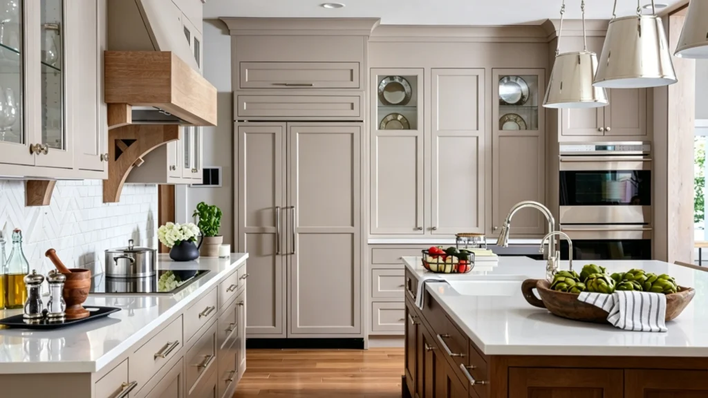
Light taupe kitchen cabinets work best in smaller kitchens or rooms with limited natural light. They keep the space feeling open and airy. The risk is that light taupe can look thin or flat without strong countertop and hardware contrast.
Warm Taupe
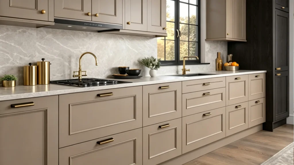
Warm taupe is my top recommendation for high-end homes, villas, and open-plan kitchens with wood floors. It has a brown undertone that feels rich without being dark. Pair it with a cream stone countertop and brushed metal hardware for a refined result.
Dark Taupe
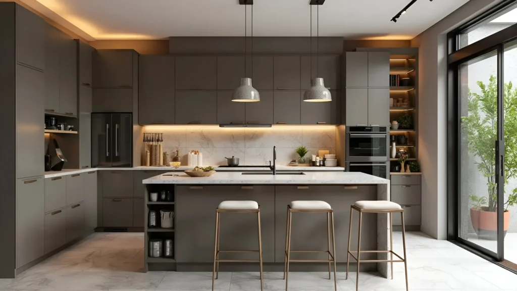
Dark taupe kitchen cabinets need strong natural light and enough space to carry the depth. Large kitchens and open-plan layouts handle dark taupe well. In a small kitchen with low ceilings, dark taupe can make the room feel closed in.
Mushroom Taupe and Taupe Greige
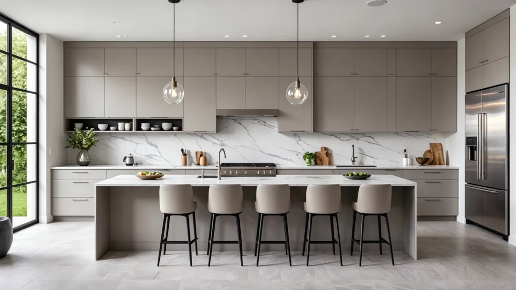
Mushroom taupe and taupe greige kitchen cabinets are the most flexible options right now. They sit between warm brown and soft gray, which makes them easy to pair with a wide range of stone, tile, and hardware options. The risk is they can read as muddy if the finish quality is low or the material palette is not controlled.
How to Test a Taupe Shade Before Production
The undertone of taupe shifts dramatically under different light. A gray undertone looks modern in daylight but cold at night. A green undertone can look refined in some lighting and dirty in others. A pink or purple undertone may clash with your stone slab.
Do not choose from a small swatch. Ask for a full cabinet door sample. Stand it vertically, place your countertop sample horizontally next to it, and photograph the combination in the morning, afternoon, and evening. View it under both 3000K warm light and 4000K neutral light. For a high-end project, I always recommend a 3D render and sample door approval before production begins.
The undertone is the thing most people miss. Two shades can look nearly identical on a small card and completely different on a full cabinet door in a real kitchen. This is not a theory. I have seen it happen on dozens of projects. A full sample check costs very little compared to the cost of repainting or replacing finished cabinets.
Expert Choice
Premium Custom Taupe CabinetsWhat Color Walls Go With Taupe Kitchen Cabinets?
Wall color is one of the most common areas where taupe kitchen cabinets go wrong. The wrong wall can make a good taupe look gray, yellow, or flat.
Warm white, creamy off-white, and soft greige walls work best with taupe kitchen cabinets. These tones add brightness without clashing with the warm undertones of taupe. Avoid cool blue-gray walls, which make taupe look dirty, and pure bright white, which can make taupe appear yellow by comparison.
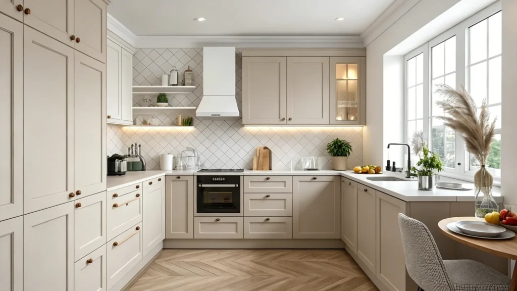
Wall Colors That Work Well
- Warm white: Keeps the taupe looking clean and fresh. Good for modern taupe kitchen cabinets.
- Creamy off-white: Softens the whole space. Works especially well with warm taupe or mushroom taupe.
- Light greige: A natural bridge color. Good for open-plan spaces where the kitchen connects to a living area.
- Soft sage or muted blue-green: For kitchens with a design-forward look. Works best when the taupe is warmer in tone.
- Plaster beige or limewash: Suits high-end villas and quiet luxury projects.
Wall Colors to Avoid
Too-cool blue-gray walls pull taupe toward a muddy, directionless middle. Very yellow cream walls push taupe toward old beige. A wall color too close in value to the cabinet face removes all contrast and flattens the room.
Kitchen Orientation Matters
North-facing kitchens already have cooler, softer light. Do not compound that with a cool taupe and a cool white wall. West-facing kitchens get warm afternoon sun. Avoid combinations that read too orange or yellow in that light. In an open-plan kitchen, the wall color must also work with the living room flooring and furniture.
A practical rule I give clients: if you are unsure, choose a wall color two to three shades lighter than the cabinet door. That built-in contrast prevents the room from reading as one flat tone. You can always adjust at the final stage, but it is much harder to fix after installation.
What Countertops Work Best With Taupe Kitchen Cabinets?
The countertop is the surface closest to the cabinet face. It has the most direct impact on how the taupe reads in a finished kitchen.
White quartz and cream stone countertops pair best with most taupe kitchen cabinets. For a warmer, more luxurious result, use Taj Mahal quartzite or beige stone. For a modern contrast, dark countertops including black granite work well in larger kitchens with strong light.
Pairing by the Effect You Want
Bright and Clean
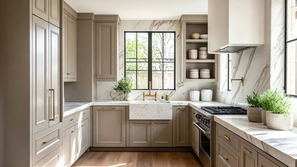
White quartz or soft white stone keeps taupe looking fresh. This works in most kitchens and is the safest choice for apartments or smaller spaces.
Warm Luxury
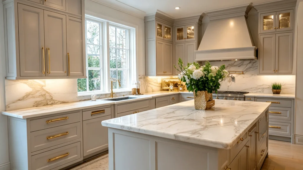
Taj Mahal quartzite, cream marble, and warm beige stone all support the richness of warm taupe kitchen cabinets. The key is that the veining should be soft, not too busy.
Modern Contrast
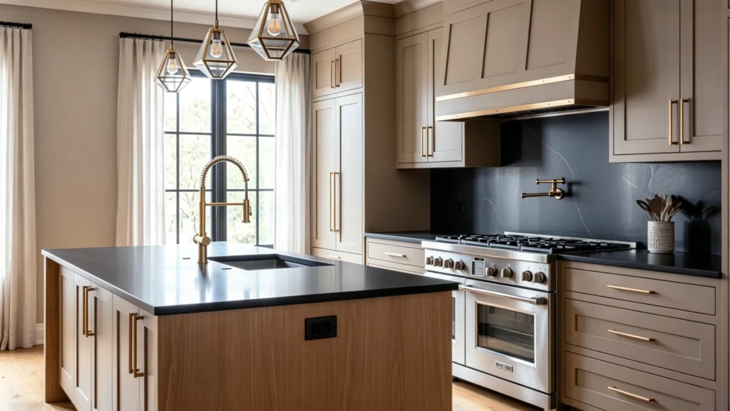
Taupe kitchen cabinets with black countertops create a high-contrast, graphic look. This works well in large kitchens and open-plan layouts. In a small kitchen, black countertops can feel heavy.
Natural and Relaxed
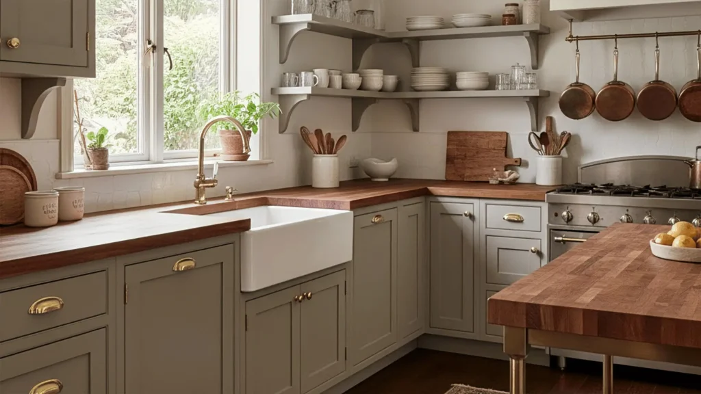
Wood or butcher block countertops bring warmth and texture. They pair best with light taupe or mushroom taupe for a casual, natural feel.
Durable Boutique Option
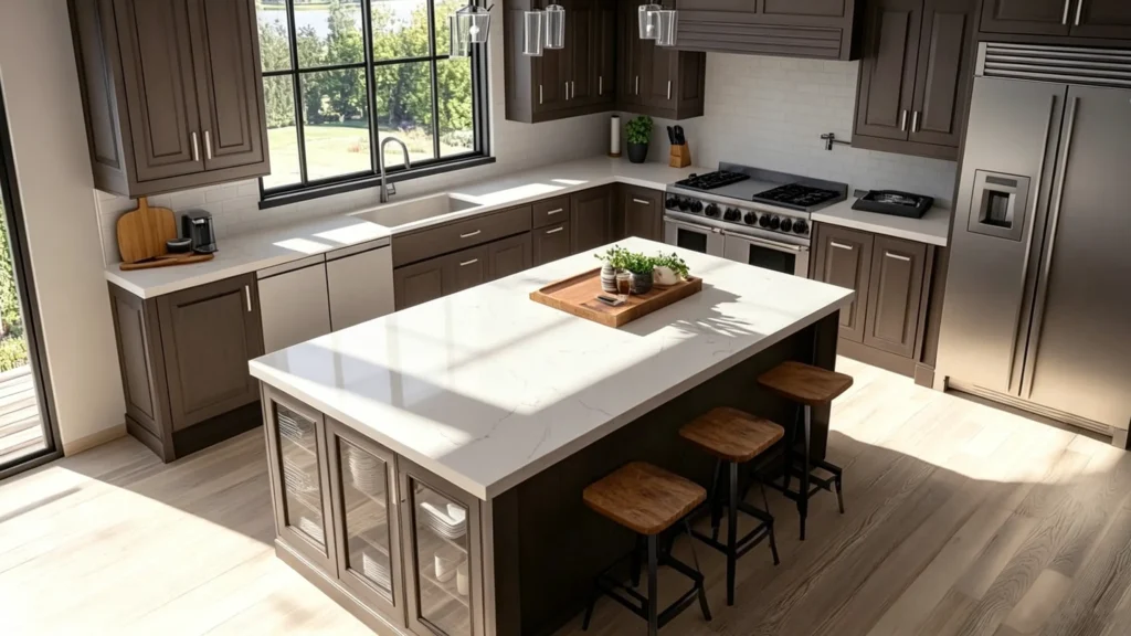
Sintered stone and engineered quartz give consistent color with low maintenance. Good for high-traffic kitchens where real stone would be hard to keep clean.
How to Avoid Countertop and Cabinet Conflicts
Place the cabinet door sample vertically. Place the stone slab or countertop sample horizontally beside it. Add your floor tile or flooring sample. Look at all three together in morning light and again in evening light. Do not finalize a stone selection under warehouse fluorescent lighting alone.
Too many warm brown and beige tones layered together without contrast reads as flat and heavy. A cold white countertop can push a warm taupe cabinet toward yellow. A very busy stone pattern on top of a deep taupe cabinet with a detailed backsplash creates visual noise.
The island is a good place to use a statement stone if you want something with more movement or drama. Keep the perimeter countertops calmer. That gives the space one focal point and prevents the whole room from competing with itself.
What Backsplash and Hardware Look Best With Taupe Cabinets?
Backsplash and hardware are the finishing layer of a taupe kitchen. They set the tone for the entire room. Getting them wrong is easy. Getting them right is what makes the kitchen feel designed rather than assembled.
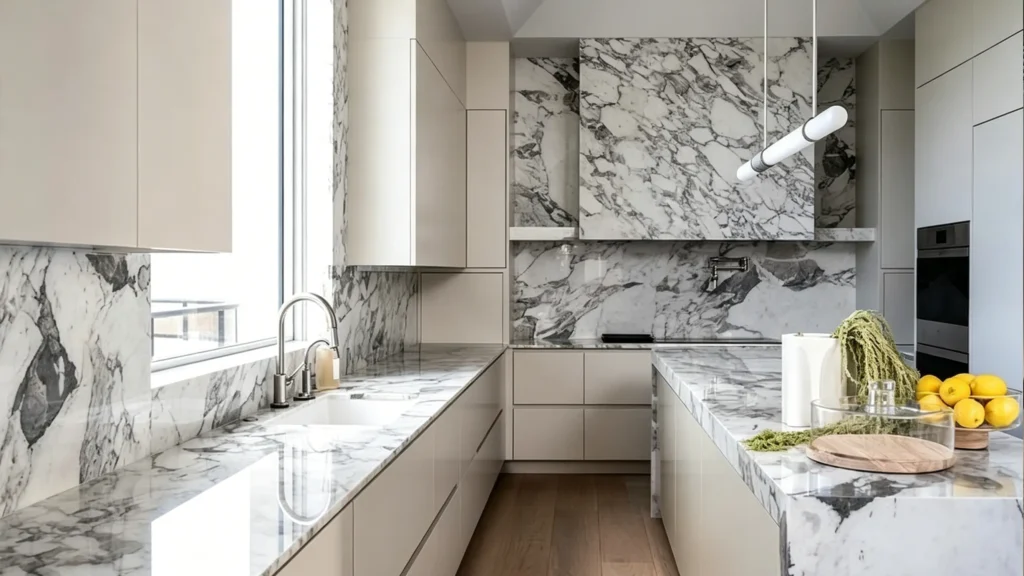
Warm white handmade tile, cream zellige, and marble slab backsplashes all work well with taupe kitchen cabinets. For hardware, aged brass, brushed brass, and polished nickel all support taupe’s warmth. Matte black works as a contrast accent but should not dominate the hardware palette.
Backsplash Options That Work
- Warm white handmade tile: Adds texture without competing with the cabinet.
- Cream zellige: Brings movement and craft. Works best with warm or mushroom taupe.
- Marble or stone slab: Clean and elegant. Extends the countertop material for a seamless look.
- Subtle herringbone or large-format tile: Adds pattern without visual noise.
- Muted green tile: Works with taupe greige cabinets in a kitchen with natural light.
Backsplash Options to Avoid
Very cool gray tile makes taupe look dirty. Busy mosaic patterns compete with the cabinet color and the countertop veining at the same time. Dark backsplashes in small kitchens without under-cabinet lighting make the work zone feel dim and heavy.
Hardware That Works With Taupe
Aged brass has a traditional, high-end quality. Brushed brass adds modern warmth. Polished nickel reads as clean and precise. Matte black creates contrast but requires restraint. Bronze suits deep taupe and natural wood pairings.
How to Mix Metals Without It Looking Busy
Keep your total metal count to two or three finishes across the whole kitchen. Your faucet and pot filler can match. Your cabinet pulls and pendant lights can share one other finish. Beyond that, the space starts to look unplanned rather than layered.
Think of the backsplash, hardware, faucet, lighting, and appliances as one system rather than five separate decisions. Each piece affects how the others read. A brushed brass faucet next to chrome cabinet pulls and matte black lighting pulls the eye in three directions at once. Decide on the metal direction early, before any of these items are ordered.
Should You Choose Light Taupe, Dark Taupe, Greige, or Mushroom Cabinets?
The best taupe shade for your kitchen is not about personal preference alone. It depends on your space conditions: room size, natural light, floor color, and how the space connects to the rest of your home.
Light taupe suits small kitchens with limited light. Warm taupe fits high-end homes with wood floors. Dark taupe works in large, open kitchens with strong natural light. Taupe greige is best for modern kitchens that want a gray-leaning neutral. Mushroom taupe suits organic and quiet luxury design projects.
| Shade | Best For | Main Risk | How to Balance |
|---|---|---|---|
| Light taupe | Small kitchens, apartments, low light | Can look thin or flat | Add stone, hardware, and wood floor detail |
| Warm taupe | Villas, open kitchens, wood floors | May read too yellow | Use warm white walls and cream stone |
| Dark taupe | Large kitchens, strong natural light | Can feel heavy | Keep countertop and backsplash lighter |
| Taupe greige | Modern kitchens, gray-leaning taste | May read cold | Add warm lighting and brass accents |
| Mushroom taupe | Quiet luxury, organic style projects | Can look muddy | Pair with clean countertop and clear contrast |
Each shade works. None of them is the single best option. The right choice depends on your ceiling height, how much light enters the room, what your floor looks like, and what mood you want the kitchen to carry. For two tone taupe kitchen cabinets — where the island is a darker shade and the perimeter is lighter — the same rules apply. Test both door samples in the actual space before deciding.
The design decision is not which shade is most beautiful in a photo. It is which shade holds up well in your actual kitchen at seven in the morning, under your specific artificial light, against your specific floor and wall. That is the question worth spending time on, and it is the one most people skip.
Project Snapshot: Luxury Waterfront Villa
A Canadian developer faced severe metamerism—the selected mushroom taupe shifted into an unstable pink-purple undertone under the local low-angle northern light.
George adjusted the paint formula using specific matte anti-reflective coatings and coordinated full-house materials (vanities, doors, and flooring) in one unified tone.
Zero color-clash on site. The entire millwork package achieved absolute visual consistency, raising the villa’s final appraisal value.
What Makes Taupe Kitchen Cabinets Look Expensive Instead of Cheap?
I have seen the same taupe color look refined in one project and cheap in another. The color is rarely the problem. The finish, the proportions, and the details are what separate a high-end result from a disappointing one.
Taupe kitchen cabinets look expensive when the door proportions are balanced, the finish is matte or satin, the edges are clean, and the hardware is consistent. They look cheap when the paint is uneven, the edge treatment is rough, the cabinet color blends into the wall and floor with no contrast, and the hardware is oversized or mismatched.
What Creates the High-End Look
- Door proportions that are not too thick or too boxy
- Matte or satin finish, not high-gloss
- Clean edge banding, tight corner joints, and flush reveals
- Hardware at consistent heights with accurate hole placement
- Under-cabinet lighting that prevents the taupe from going dark and flat
- A material palette with clear contrast between cabinet, countertop, and backsplash
- Consistent metal finish across hardware, faucet, and lighting
What Makes Taupe Look Cheap
- Cabinet color too close to a dirty beige
- No contrast between the cabinet, wall, floor, and countertop
- Hardware that is too black and too heavy for the cabinet style
- Busy stone pattern that competes with everything else in the room
- Cabinets that do not reach the ceiling, with a visible gap collecting dust
- Rough kickboards, exposed side panels, or uneven filler strips
From Factory Experience
I have seen the same taupe color look completely different depending on the spray quality, the substrate flatness, and the edge treatment. An uneven paint surface catches light differently across the door face and makes the color look patchy. A sharp, clean edge gives the door a precision that reads as expensive even before you notice the color.
High-end taupe kitchen cabinets cannot be judged from a render alone. A physical sample door, seen in natural light, shows you the paint evenness, the sheen level, the edge quality, and the substrate texture all at once. For any serious project, I recommend sample door approval before production, not after.
Conclusion
Taupe kitchen cabinets work beautifully when the shade, finish, and material combinations are matched to your actual space. The wrong combination turns taupe into a problem. The right one makes your kitchen feel calm, refined, and built to last.
If you are planning a taupe kitchen project and want factory-direct guidance on samples, 3D design, or full-house material supply, contact George Construction Group at georgeconstuctiongroup.com.
Ready to Build a Cohesive, High-End Space?
Transforming a luxury villa or premium apartment requires more than just picking a cabinet color—it demands flawless execution across every room. From precision-engineered custom taupe cabinetry to full-house material supply including bespoke lighting, sanitary ware, and custom furniture, we eliminate supply chain friction. Provide your floor plan below, and let our experts architect a seamless, one-stop solution for your entire property.