Many homeowners scroll through ideas for painting kitchen cabinets pictures and feel excited, then disappointed after their own project. The gap between inspiration and reality is frustrating.
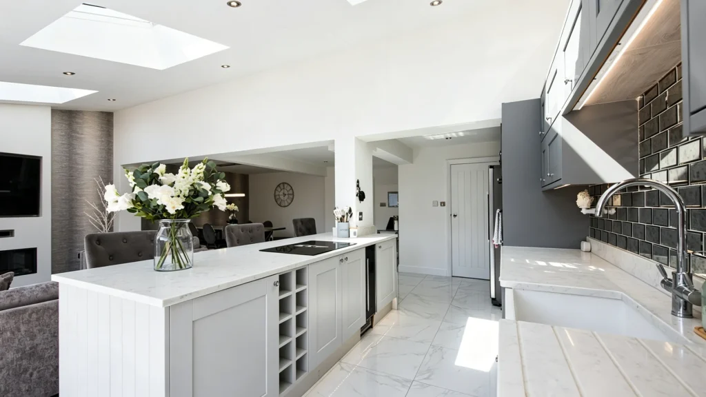
The painted kitchen cabinet ideas that look truly high-end share one thing: every element works together. Color, finish, countertop, hardware, and door style all align. No single color alone makes a kitchen look expensive.
I have worked on over 1,000 projects across apartments, villas, and boutique renovations. The difference between a kitchen that looks expensive and one that just looks painted is almost never about which color was chosen. It is about how every decision was made together, from the cabinet structure to the final hardware pull.
Which Painted Kitchen Cabinet Ideas Look High-End in Real Homes?
Most people pick a color from a picture and expect the same result at home. The space, lighting, and materials are completely different. That gap is where projects go wrong.
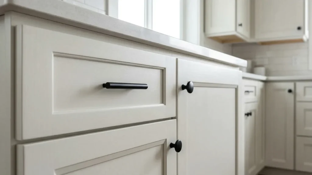
High-end painted kitchen cabinets share low-saturation color, smooth flat finish, tight door gaps, quality hardware, and a countertop that does not fight the cabinet tone. Six visual directions consistently produce that result in real homes.
Here are the six directions I see work best across actual projects:
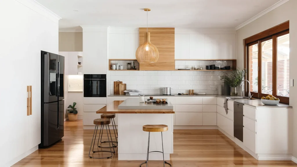
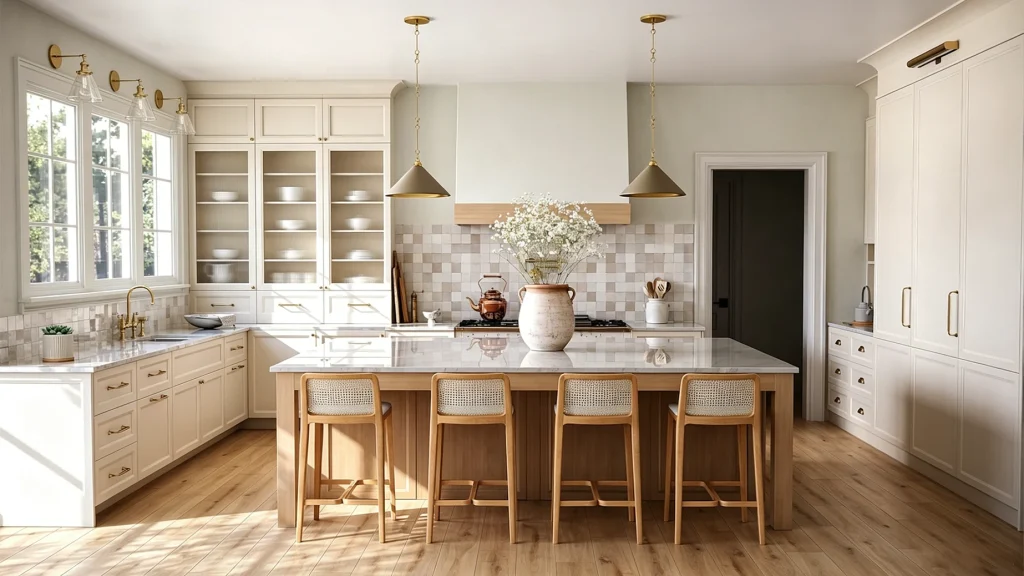
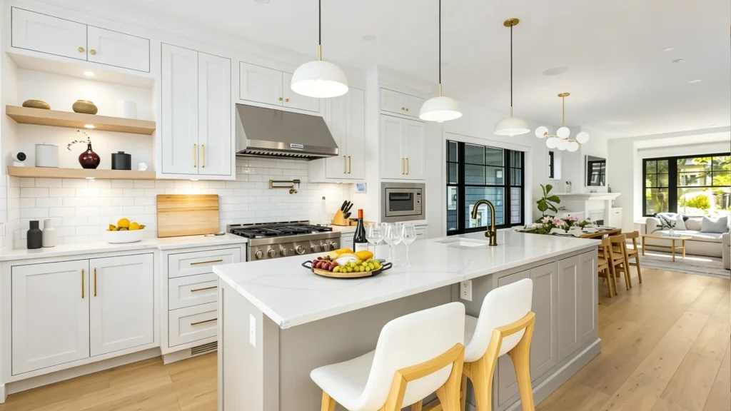
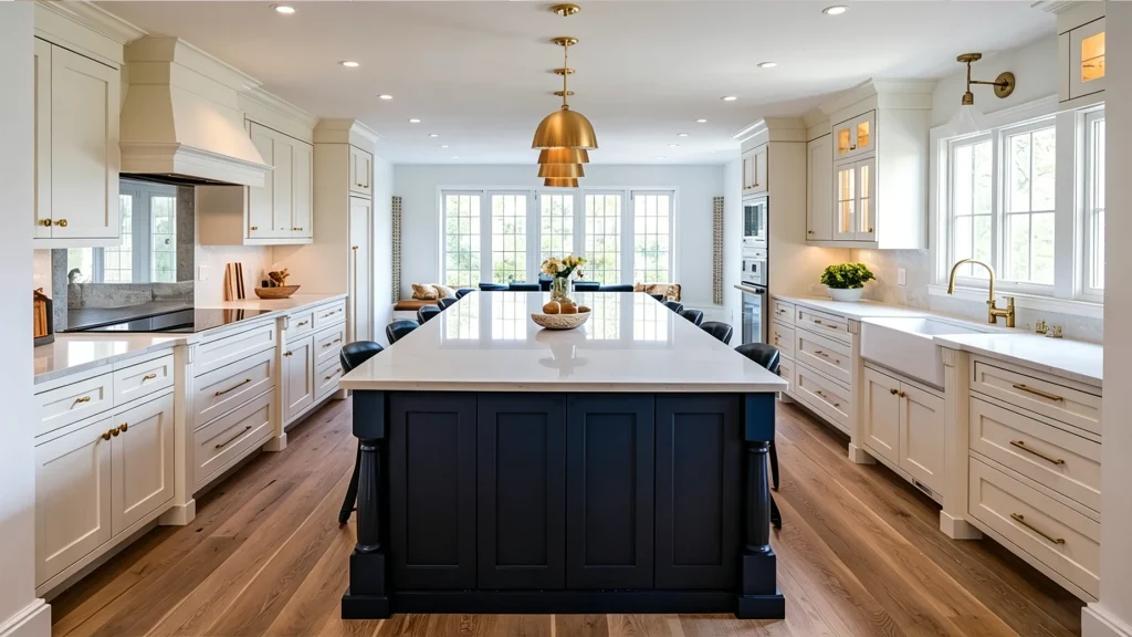
Warm White or Creamy White Cabinets
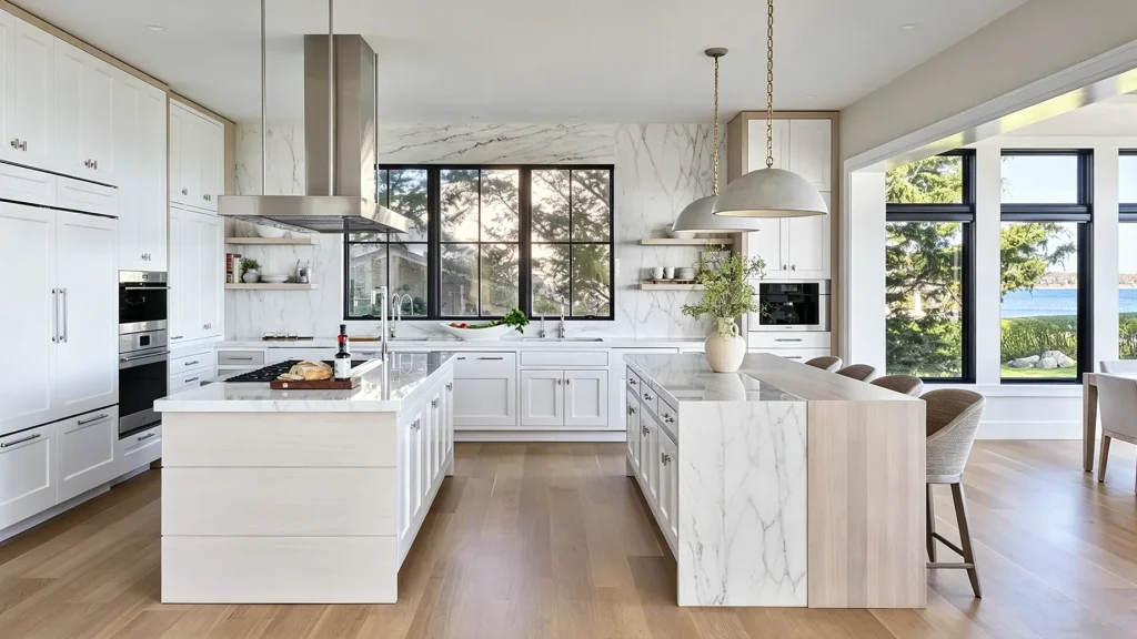
Warm white works in most kitchens because it reflects light without feeling cold. It pairs well with stone countertops, natural wood flooring, and brushed brass or matte black hardware. The finish must be smooth and even. Cold white with brush marks looks cheap.
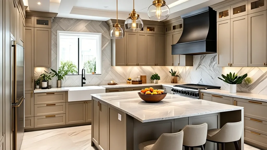
Greige or Taupe Painted Cabinets
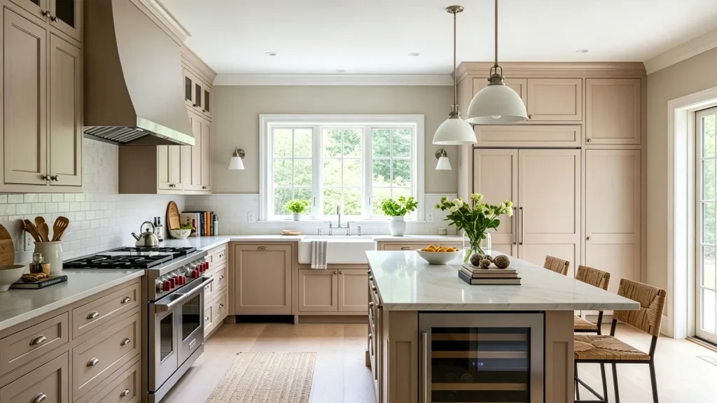
Greige sits between gray and beige. It is one of the most forgiving tones in kitchens with mixed flooring or warm lighting. It pairs well with quartz in light gray or cream, and with oil-rubbed bronze or champagne gold hardware. It works in transitional and classic kitchens equally well.
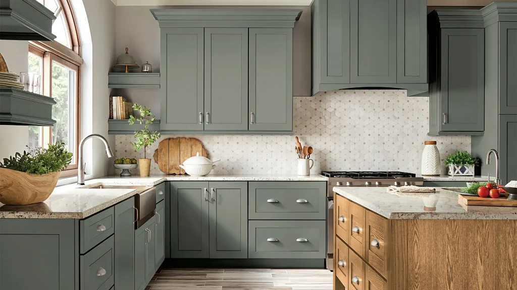
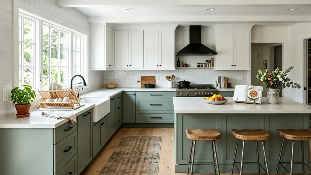
Sage Green or Olive Green Cabinets
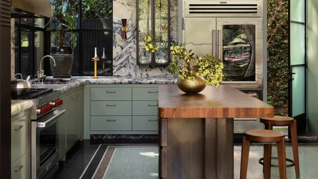
Muted sage or olive green adds character without being bold. It works well in kitchens with white oak flooring, white marble countertops, and unlacquered brass hardware. The key word is muted. Bright green looks temporary. Dusty green reads as intentional and designed.
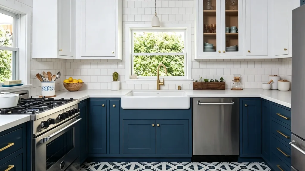
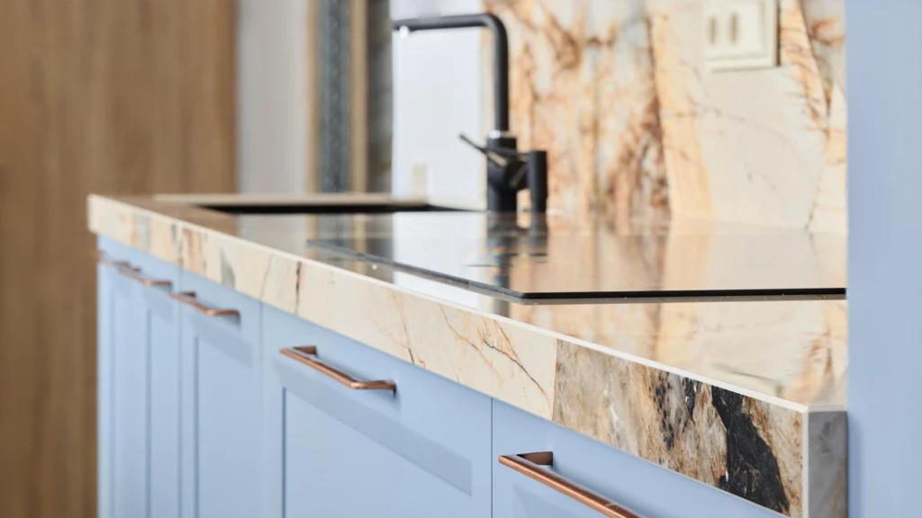
Deep navy on lower cabinets with warm white uppers is one of the most requested two tone painted kitchen cabinet ideas I receive. It works best in medium to large kitchens. It pairs well with light stone countertops and polished nickel or brass hardware. Avoid bright blue entirely.
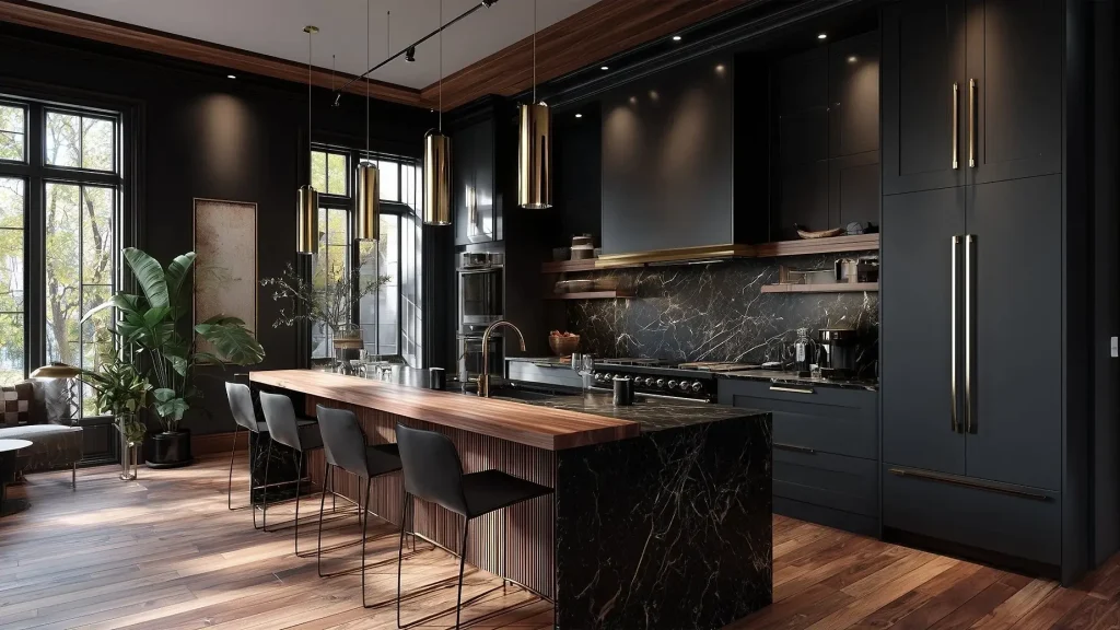
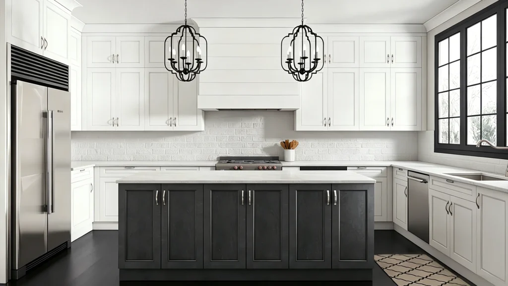
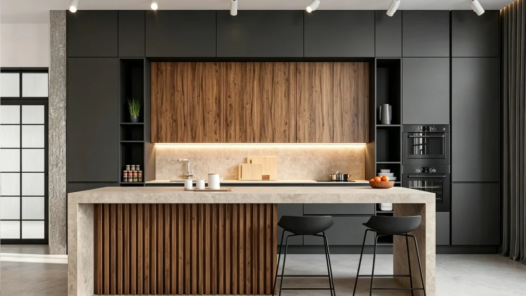
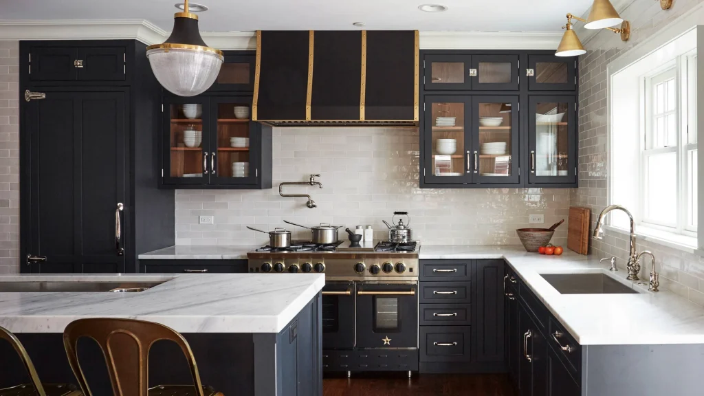
Charcoal or Soft Black Cabinets
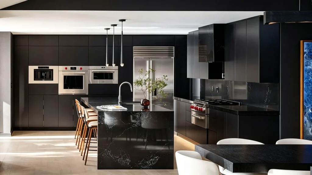
Charcoal works on islands, lower cabinets, and in large open kitchens. It needs strong lighting and a light countertop to avoid feeling heavy. Matte or eggshell finish reads more refined than high-gloss in most residential settings. Pair with white oak shelving or warm tile for balance.
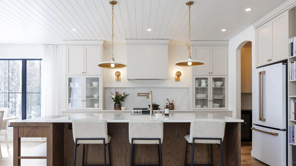
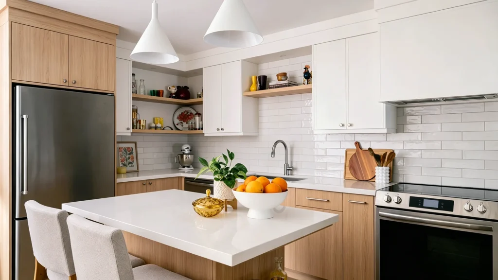
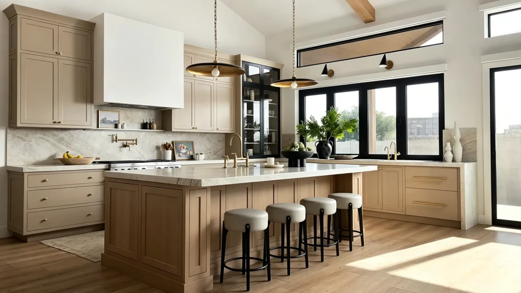
Painted Cabinets with Natural Wood Accents
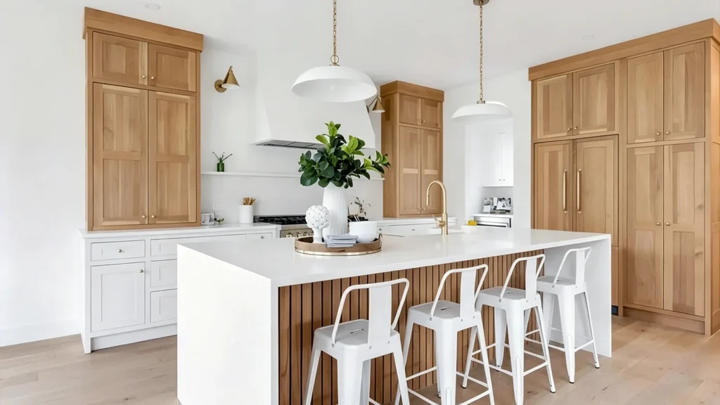
This combination is the strongest direction for 2026 high-end kitchens. A painted perimeter with a wood island, or painted upper cabinets with wood lower doors, adds warmth and texture. The wood grain breaks up the painted surface and makes the whole kitchen feel custom-designed rather than uniform.
What makes these directions look expensive is not the color name. It is the low-saturation tone, the flat clean finish, the tight door gaps, the non-generic hardware, and the countertop that does not create visual conflict. I have seen beautiful sage green cabinets look low-end because the door edges were rough and the hinges were visible and misaligned. The picture can look good. The in-person result tells a different story.
What Cabinet Paint Colors Make a Kitchen Look Expensive?
Many homeowners assume bright white or bold color equals luxury. Then the kitchen feels either sterile or trendy rather than refined. The frustration is real and common.
The best colors for kitchen cabinets that look expensive are low-saturation and warm: warm white, cream, taupe, greige, muted sage, olive, navy, charcoal, and soft black. Paint combined with natural wood is the strongest direction for 2026.
Here is why these colors read as expensive:
Low Saturation Looks More Permanent
Highly saturated colors look current for a season. Low-saturation tones look considered and calm. They age well and rarely feel like a trend mistake five years later.
Warm White Outperforms Cold White
Cool white amplifies any imperfection in finish or surface prep. Warm white is more forgiving and feels more livable. In kitchens with warm wood floors or natural stone, cold white creates an unwanted contrast.
Greens and Blues Need a Muted Undertone
Sage green works. Bright green does not. Navy works. Turquoise does not. The rule is consistent: pull the color toward gray or brown, not toward brightness.
Deep Colors Belong in Specific Zones
Charcoal and navy work on islands, lower cabinets, or appliance walls in large kitchens. Using deep color throughout a small kitchen makes the space feel smaller and heavier. Placement matters as much as color choice.
Wood Grain Combined with Paint Is the 2026 Standard
Industry data from NKBA shows wood grain finishes are growing faster than solid painted finishes. White oak in particular is in high demand. The current high-end look is not all-white. It is painted finish combined with natural wood, stone countertops, and layered soft lighting.
| Color | Best Space | Pair With | Avoid |
|---|---|---|---|
| Warm white | Any size | Stone, brass, oak | Cold white walls |
| Greige / taupe | Transitional | Quartz, bronze | High-gloss doors |
| Sage green | Medium to large | Marble, unlacquered brass | Bright tile backsplash |
| Navy | Large or island only | Light stone, nickel | Small full kitchen |
| Charcoal | Large, island | Oak shelving, warm tile | Low ceiling kitchens |
| Paint + wood | Any size | Any stone | Matching everything |
Color decisions cannot be made from a picture alone. The same warm white looks completely different in a kitchen with gray concrete floors versus warm walnut floors. Light source, ceiling height, countertop tone, and backsplash reflectivity all change what a color looks like on the cabinet. I always ask clients to look at a large painted sample in their actual kitchen under their actual lighting before committing. The color chip from a hardware store is almost useless for this decision.
What Cabinet Colors Make a Small Kitchen Look Bigger?
Small kitchens often get painted with any color that looks good online. Then the room feels darker, more crowded, or just the same size as before. The result does not match the expectation.
For small kitchens, warm white, off-white, light greige, soft taupe, pale sage, and light blue-gray are the most reliable choices. A two-tone approach with lighter uppers and slightly deeper lowers also works without making the space feel heavy.
Here is how these choices help:
Light Colors Reflect More Light
Light-toned cabinets bounce natural and artificial light around the kitchen. This makes the room feel brighter and more open without any structural change. The effect is strongest when the wall color is close to the cabinet color, reducing visual breaks.
Matching Cabinet and Wall Color Removes Visual Cuts
When the cabinet color and wall color are very close, the eye reads the surface as one continuous plane. This makes the room feel wider. A strong contrast between cabinet and wall breaks the space into smaller visual segments.
Upper Cabinets Should Always Be Lighter
In small kitchens, lighter upper cabinets feel less heavy overhead. If a two-tone look is desired, keep the upper cabinets in off-white or light greige and use a slightly deeper tone only on the lower cabinets or island.
Cabinet Height and Design Matter More Than Color
Taller cabinets that reach the ceiling, panel-front appliances, integrated handles, and clean flat door profiles do more for a small kitchen than any color choice alone. Color supports good design. It does not replace it.
I have seen small kitchens painted in perfect pale sage that still felt cramped because the upper cabinets stopped 30 centimeters from the ceiling, the lighting was weak, and the countertop had too much visual pattern. Color is one tool. The cabinet height, door profile, integrated storage, and lighting complete the job. If the cabinet layout is working against the space, painting alone will not fix it. That is where factory-designed custom cabinets, sized specifically for the room, change the outcome more than any color choice will.
Which Two-Tone Painted Kitchen Cabinet Ideas Look Timeless?
Two-tone cabinets look elegant in some kitchens and messy in others. The difference is not obvious from a single inspiration picture. Getting this wrong is easy.
The most timeless two tone painted kitchen cabinet ideas use one neutral and one grounded tone in a clear proportion. White or cream uppers with a darker lower or island is the most reliable structure. Wood combined with paint adds warmth that paint alone cannot achieve.
Here are five combinations I recommend consistently:
White Uppers with Wood Lowers
This is the most natural-feeling combination. The painted upper cabinets keep the space light. The wood lower cabinets add warmth and texture. White oak or walnut both work, depending on whether the kitchen leans modern or transitional.
This combination works in medium to large kitchens. The navy island becomes the visual anchor. The warm white perimeter keeps the space from feeling dark. Light stone countertops on both surfaces hold the combination together.
Sage Green Lowers with White Uppers
This direction is popular in open-plan kitchens connected to living spaces. The sage lowers feel grounded and calm. The white uppers stay light. This combination works well with natural stone floors and simple flat-panel doors.
Taupe Cabinets with Natural Oak Island
This is a quieter combination that reads as very refined. Both tones are warm and low-saturation. Nothing competes. This direction works particularly well in villa kitchens and boutique hotel rooms where a calm, custom feel is the goal.
Charcoal Lower Cabinets with Light Stone Countertop
Deep charcoal on lower cabinets with a very light countertop creates strong contrast without using an accent color. This works in modern and industrial-leaning kitchens. The countertop must be pale enough to separate clearly from the cabinet.
The proportion rule matters most: one tone should dominate and one should accent. A 50-50 split between two colors almost always creates visual tension. In small kitchens, the lighter tone should take the larger share. In large kitchens, the deeper tone can appear on the island, lower cabinets, or an appliance wall. For projects involving multiple apartment units or boutique properties, color consistency across batches becomes a real concern. Two-tone cabinet orders must specify exact color codes and finish levels for every batch to avoid visible differences between units at delivery.
Case Snapshot: Luxury Apartment Project
A developer renovating 45 high-end apartments struggled with local painters. The two-tone design looked inconsistent unit-to-unit, and the hand-painted surfaces were already showing brush marks and peeling edges before tenants moved in.
We stepped in with factory-finished custom cabinets. We provided exact color matching for warm white uppers and natural oak lowers, ensuring batch consistency through strict pre-shipment QC and standardized gap alignment.
A flawless, minimalist aesthetic across all 45 units. The developer saved on long-term replacement costs and accelerated their project timeline with zero installation delays.
What Do Painted Cabinet Pictures Not Show About Durability?
Online pictures of painted kitchen cabinets always look perfect. The corners are sharp, the finish is smooth, and the hardware gleams. Real kitchens after two years of daily use look different.
Painted cabinet pictures do not show surface preparation quality, primer adhesion, edge treatment, cabinet material, or how the finish responds to daily cleaning and contact. These factors determine whether the result lasts three years or fifteen.
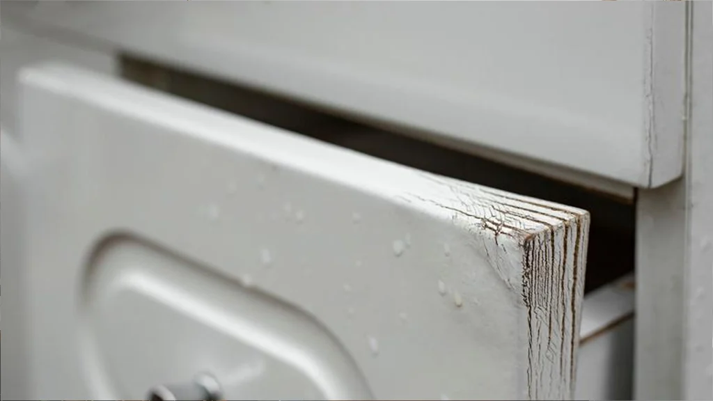
Here are the specific durability issues that pictures hide:
Chipping at Edges and Contact Points
Chipping appears first at door corners, around hardware, and along drawer edges. It is almost always a sign of poor edge prep, thin primer, or paint applied over a surface that was not fully cleaned and sanded. A picture taken at installation never shows this.
Peeling from Poor Adhesion
Peeling is different from chipping. It usually appears as a larger section lifting from the substrate. Common causes include painting over glossy old finish without proper sanding, using incompatible primer, or applying paint before the surface was fully dry. MDF and thermofoil substrates are particularly vulnerable.
Brush Marks in the Finish
Brush marks appear when paint is applied by hand without the right tools or technique. In pictures, they are hidden by distance and lighting. In person, they are obvious under natural light. Factory spray application eliminates this problem entirely.
Yellowing on White and Light Finishes
White and cream painted cabinets can yellow over time due to paint chemistry, UV exposure, and cleaning product residue. Oil-based paints yellow faster. Waterborne lacquer systems are more stable but still need correct application and curing time.
Finish That Shows Every Touch
Very matte finishes look beautiful in photographs but show fingerprints and cleaning marks quickly in real use. High-contact areas like door fronts around handles and drawer pulls need a finish with at least some sheen to remain cleanable.
The most useful way to judge a painted cabinet finish from a picture is to look at the close-up details, not the wide-angle beauty shot. Check the door edges, the area around the hardware, the drawer fronts, and any seam or joint line. Look for sharpness, uniformity, and clean gaps. If the only pictures available are wide-angle room shots with soft lighting, that is not enough information to judge finish quality. Ask for close-up samples and detail photographs before making a decision on any cabinet project.
Should You Paint Kitchen Cabinets, Replace Doors, or Order Custom Cabinets?
Many homeowners assume painting is always the most affordable path. Sometimes it is. Sometimes the structure does not support it and the money is spent twice. Knowing which path fits the situation saves time and budget.
If the cabinet boxes are solid and the layout works, painting or refinishing may be enough. If the doors are warped, the finish is failing, or the kitchen needs a higher-end result, replacing doors or ordering factory custom cabinets is the safer and often more cost-effective choice.
| Situation | Best Path | Why |
|---|---|---|
| Good structure, limited budget | Paint or refinish | Cost-efficient short-term update |
| Good boxes, outdated door style | Replace doors | Better result, keeps existing layout |
| Warped, damaged, or failing finish | New custom cabinets | Repainting failing surfaces costs more long-term |
| Villa, boutique, or high-end project | Factory-finished custom | Consistent finish, exact sizing, custom color |
| Multiple units, batch project | Factory order | Color consistency, matching spare parts, installation code |
Here is how I think about each path:
Painting: When It Works
Painting works when the cabinet boxes are structurally sound, the door profile still suits the space, and the goal is a color refresh rather than a design change. Budget renovations and short-term updates are good candidates.
Professional Spray Finish: When It Is Worth the Cost
Professional shop-applied spray finish produces a smoother result than brush or roller application on-site. The cost is higher, but the finish is closer to factory quality. This is the middle path between DIY painting and full cabinet replacement.
Door Replacement: When to Consider It
If the cabinet boxes are in good condition but the doors are warped, the profile is outdated, or the gaps are uneven, replacing only the doors is often more efficient than repainting. New doors also allow a full profile and finish change without touching the existing structure.
Custom Factory Cabinets: When It Makes the Most Sense
For villas, apartments under renovation, boutique hotel kitchenettes, or any project where the kitchen layout needs to change, custom factory cabinets are the right answer. Factory finishing is consistent, color is exactly specified, sizing is precise, and replacement parts are available. For a project planning five to ten years of daily use, the total cost calculation often favors custom cabinets over painting and repainting an aging structure.
The decision changes based on the project timeline and the end user. For a home preparing for resale, a clean repaint in a neutral warm white may be the right choice. For a boutique property running daily guest use, a factory-finished cabinet with a verified lacquer system and available spare parts is the better investment. Knowing which situation applies before committing to a path is the most important step in the decision.
What Real Project Pictures Should You Show Before Deciding?
Most online cabinet pictures are wide-angle beauty shots taken in perfect lighting. They look inspiring. They do not give enough information to judge whether the result will hold up in a real kitchen.
The most useful painted cabinet pictures show close-up finish detail, edge treatment, drawer fronts, hardware placement, countertop matching, and how the kitchen reads under natural light. Wide-angle shots alone are not enough for a quality decision.
Here are the four types of pictures worth reviewing before any cabinet decision:
Full Kitchen View Under Natural Light
The wide-angle view shows how the color reads in the full space, how the proportions feel, and how the cabinet tone interacts with the floor and countertop. This picture is a starting point, not an ending point.
Close-Up of Door Surface, Edges, and Hardware Area
This picture shows finish smoothness, edge sharpness, paint behavior near hardware holes, and gap consistency between doors. These details predict durability and craft level better than any wide shot.
Countertop, Cabinet, Flooring, and Hardware Together
A detail picture showing all four surfaces together shows whether the combination works in real material terms. This is more useful than digital mockups because it shows actual texture, reflectivity, and undertone interaction.
QC, Packaging, and Pre-Shipment Documentation
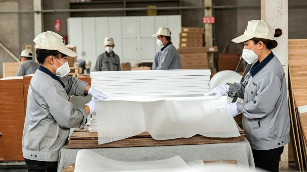
For any project involving custom or factory-ordered cabinets, pictures of quality control inspection, packaging protection, and pre-shipment checks show that the supplier treats the finish as seriously after production as during it.
For projects covering multiple apartments, villa phases, or boutique units, single beautiful pictures are not the right reference. What matters is batch consistency: every door in the same color, every panel from the same production run, every replacement piece matching the original finish. Suppliers who can show numbered installation photos, consistent QC records, and available spare parts offer a level of project reliability that image-only suppliers cannot match. The picture is the starting conversation. The documentation is the real confidence.
Conclusion
The right painted kitchen cabinet idea is never just a color. It is a complete decision that covers finish, material, proportion, hardware, and long-term use. If you are planning a kitchen update and want guidance from real project experience, contact George Construction Group to discuss your space.
Simplify Your Full-House Renovation
A truly luxurious interior requires more than just beautiful cabinets—it demands harmony across every room. From custom bathroom vanities and spatial planning to premium furniture, sanitary ware, and lighting, we provide a complete one-stop procurement solution. Eliminate the hassle of managing multiple suppliers and ensure absolute consistency across your entire villa or apartment project. Submit your project details below to begin.